Making Data Incomprehensible
March 8, 2023
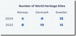
I spotted a short write up with 100 pictures called “1 Dataset 100 Visualizations.” The write up presents a simple table:
And converts or presents the data 100 different ways.
Here’s an example:
My reactions to the examples are:
- Why are the colors presented with low contrast. Many of the charts’ graphics are incomprehensible. The texts’ illegibility underscores the disconnect between being understood and being in a weird world of incomprehensibility.
- What’s wrong with the basic table? It works. Why create a graph? Oh, I know. To be clever. Nope, not clever. Performative demonstration of numerical expertise perhaps?
- The Wall Street Journal and other “real news” organizations love these types of obscurification. I can visualize the goose bumps which form on the arms of these individuals. The anticipation of making something fuzzy is a thrilling moment.
Yikes. Marketing methods to be unclear.
Stephen E Arnold, March 8, 2023


