Google Maps: Rapid Progress on Un-Usability
November 30, 2023
 This essay is the work of a dumb dinobaby. No smart software required.
I read a Xhitter.com post about Google Maps. Those who have either heard me talk about the “new” Google Maps or who have read some of my blog posts on the subject know my view. The current Google Maps is useless for my needs. Last year, as one of my team were driving to a Federal secure facility, I bought an overpriced paper map at one of the truck stops. Why? I had no idea how to interact with the map in a meaningful way. My recollection was that I could coax Google Maps and Waze to be semi-helpful. Now the Google Maps’s developers have become tangled in a very large thorn bush. The team discusses how large the thorn bush is, how sharp the thorns are, and how such a large thorn bush could thrive in the Googley hot house.
This dinobaby expresses some consternation at [a] not knowing where to look, [b] how to show the route, and [c] not cause a motor vehicle accident. Thanks, MSFT Copilot. Good enough I think.
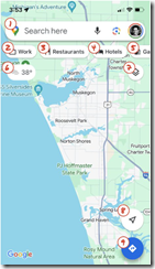
The result is enhancements to Google Maps which are the digital equivalent of skin cancer. The disgusting result is a vehicle for advertising and engagement that no one can use without head scratching moments. Am I alone in my complaint. Nope, the afore mentioned Xhitter.com post aligns quite well with my perception. The author is a person who once designed a more usable version of Google Maps.
Her Xhitter.com post highlights the digital skin cancer the team of Googley wizards has concocted. Here’s a screen capture of her annotated, life-threatening disfigurement:
She writes:
The map should be sacred real estate. Only things that are highly useful to many people should obscure it. There should be a very limited number of features that can cover the map view. And there are multiple ways to add new features without overlaying them directly on the map.
Sounds good. But Xooglers and other outsiders are not likely to get much traction from the Map team. Everyone is working hard at landing in the hot AI area or some other discipline which will deliver a bonus and a promotion. Maps? Nope.
The former Google Maps’ designer points out:
In 2007, I was 1 of 2 designers on Google Maps. At that time, Maps had already become a cluttered mess. We were wedging new features into any space we could find in the UI. The user experience was suffering and the product was growing increasingly complicated. We had to rethink the app to be simple and scale for the future.
Yep, Google Maps, a case study for people who are brilliant who have lost the atlas to reality. And “sacred” at Google? Ad revenue, not making dear old grandma safer when she drives. (Tesla, Cruise, where are those smart, self-driving cars? Ah, I forgot. They are with Waymo, keeping their profile low.)
Stephen E Arnold, November 30, 2023


