Useful Probability Wording from the UK Ministry of Defence
August 8, 2023
 Note: This essay is the work of a real and still-alive dinobaby. No smart software involved, just a dumb humanoid.
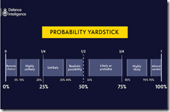
“Have You Ever Wondered Why Defence Intelligence Uses Terms Like “Unlikely” or “Realistic Possibility” When We Assess Russia’s War in Ukraine?” provides two useful items of information. Many people will be familiar with the idea of a “probability yardstick.” Others — like some podcast pundits and YouTube yodas — may not have a firm grasp on the words and their meaning.
I have reproduced the Ministry of Defence’s Probability Yardstick, which appeared in February 2023 in the unclassified posting:
Some investment analysts and business consultants have adopted this or a similar “yardstick.” Many organizations have this type of visual representation of event likelihoods.
The article does not provide real-life examples of the use of the yardstick. That’s is a good decision. For those engaged in analysis and data crunching, the idea of converting “numbers” into a point on a yardstick facilitates the communication of risk.
Here’s one recent example. A question like the impact of streaming on US cable companies is presented in the article “As Cable TV is Losing Millions of Subscribers, YouTube TV Is Now The 5th Largest TV Provider & Could Soon Be The 4th Largest” does not communicate the type of information a senior executive wants; that is, how likely is it the trend will continue. Pegging the loss of subscribers on the yardstick in either the “likely or probable” or “highly likely” communicates quickly and without word salad. The “explanation” can, of course, be provided.
In fast-moving situations, the terminology of the probability yardstick and its presentation of what is a type of confidence score is often useful. By the way, in the cited Cable TV article, the future is sunny for Google and TikTok, but not so good for the traditional companies.
Stephen E Arnold, August 8, 2023
Data Visualization: Perfect for Innumerate Thumbtypers
December 23, 2020
Why do tech experts keep reminding us about the power of data visualization? Any preschool teacher knows that pictures with lots of colors are more interesting to their students than lines of text. Do people forget that fact when they graduate to adulthood or do they fail to integrate their childhood lessons into their brains?
4iQ describes itself as the Adversary Intelligence Company, which makes me think they are empowering super villains with technology, and they published an article on Medium: “The Power Of Visualization: Analysis In A Tsunami Of Information.” The article is obviously a press release to push potential clients to 4iQ’s Web site. It discusses how most law enforcement organizations do not include data visualization in their briefings/meetings due to their information’s nature. Here is something all preschool teachers know, but said in fancy jargon:
“In an era where so much information is at our fingertips, the value of data visualization has never been greater, and this includes both the data as well as the visual need to tell a compelling story. In most situations, images speak louder than words. With over 50% of our brains devoted to visual processing, a good visualization tool is just as important as a detailed analytical report. In fact, when used purposefully, visualization can serve as a standalone mechanism communicating essential findings needed to inform decision-makers.”
The rest of the article describes ways to visual law enforcement data blah blah and yada yada. Since the article is about data visualization 4iQ should have included examples of how they visual data—you know, pictures with lots of colors.
Whitney Grace, December 23, 2020
Exclusive: Interview with DataWalk’s Chief Analytics Officer Chris Westphal, Who Guides an Analytics Rocket Ship
October 21, 2020
I spoke with Chris Westphal, Chief Analytics Officer for DataWalk about the company’s string of recent contract “wins.” These range from commercial engagements to heavy lifting for the US Department of Justice.

Chris Westphal, founder of Visual Analytics (acquired by Raytheon) brings his one-click approach to advanced analytics.
The firm provides what I have described as an intelware solution. DataWalk ingests data and outputs actionable reports. The company has leap-frogged a number of investigative solutions, including IBM’s Analyst’s Notebook and the much-hyped Palantir Technologies’ Gotham products. This interview took place in a Covid compliant way. In my previous Chris Westphal interviews, we met at intelligence or law enforcement conferences. Now the experience is virtual, but as interesting and information in July 2019. In my most recent interview with Mr. Westphal, I sought to get more information on what’s causing DataWalk to make some competitors take notice of the company and its use of smart software to deliver what customers want: Results, not PowerPoint presentations and promises. We spoke on October 8, 2020.
DataWalk is an advanced analytics tool with several important innovations. On one hand, the company’s information processing system performs IBM i2 Analyst’s Notebook and Palantir Gotham type functions — just with a more sophisticated and intuitive interface. On the other hand, Westphal’s vision for advanced analytics has moved past what he accomplished with his previous venture Visual Analytics. Raytheon bought that company in 2013. Mr. Westphal has turned his attention to DataWalk. The full text of our conversation appears below.
Waze: Suffering from the Rona?
September 18, 2020
Less driving and carpooling during the pandemic means less ad revenue for a certain navigation and mapping service. The Verge reports, “Google’s Waze Lays Off 5 Percent of its Workforce, Closes Offices in Asia and Latin America.” For Waze, that five percent represents about 30 folks out of its 555 workers. Those jobs mostly come from the sales, marketing, and partnerships departments. The company hopes to strike a balance by adding a similar number of jobs in technology and engineering in upcoming months. We wish them luck with that. The offices to be shuttered in Malaysia, Singapore, Colombia, Chile, and Argentina also represent a trade-off. Waze plans to focus more on markets in which it had been growing—the US, the UK, France, Brazil, Canada, Italy, and Mexico.
Reporter Andrew J. Hawkins writes:
“As shelter-in-place and working from home become the new norm, fewer people are using Waze for their daily navigation needs. Fewer eyeballs on the app means less advertising revenue for the company. Waze, which was acquired by Google in 2013 for a reported $1.1 billion, has seen a dip in both monthly active users, or the number of customers using the app each month, and driven kilometers, the metric by which the company measures how far its customers drive while using Waze.”
Though Waze’s numbers have been gradually recovering since lockdown restrictions were lifted in some countries, the global weekly driven kilometers dipped by a striking 70 percent in June. As one might imagine, usage the company’s ride-sharing service, Waze Carpool, has also dwindled. We’re told:
“With more people working from home, fewer people are using Waze Carpool to share rides with co-workers or other neighbors who work along a similar route. As a result, Waze is shrinking the number of people who work on its standalone carpooling service. Earlier this year, Waze was on track to cross 1 million monthly carpool trips globally, and now the company is nowhere near that, a spokesperson said.”
DarkCyber finds that completely unsurprising. Hawkins gets much of his information from an email Waze’s CEO Noam Bardin sent to employees, which is reproduced in full at the end of the article. He notes the company is sympathetic to its workers who must say goodbye, and Bardin pledges to help them into the beginning of next year with severances, bonuses, and health insurance.
Cynthia Murrell, September 18, 2020
Mathematica Not Available? Give Penrose a Whirl
June 7, 2020
If you want to visualize mathematical procedures, you can use any number of tools. Wolfram Mathematica is a go to choice for some folks. However, Penrose, a new tool, is available. The system is described in “CMU’s ‘Penrose’ Turns Complex Math Notations Into Illustrative Diagrams.” The article reports:
The CMU team similarly designed Penrose to codify the best practices of mathematical illustrators in a way that is reusable and widely accessible. Ye says Penrose enables users to create diagrams by simply typing in mathematical expressions that describe relationships, whereupon “the tool automatically takes care of laying everything out.”
More information is available at this link.
Stephen E Arnold, June 7, 2020
Data Visualizations: An Opportunity Converted into a Border Wall
May 18, 2020
I read “Understanding Uncertainty: Visualizing Probabilities.” The information in the article is useful. Helpful examples make clear how easy it is to create a helpful representation of certain statistical data.
The opportunity today is to make representations of numeric data, probabilities, and “uncertainty” more easily understandable.
The barrier is that “good enough” visualizations can be output with the click of a mouse. The graphic may be attractive, but it may distort the information allegedly presented in a helpful way.
But appearance may be more important than substance. Need examples. Check out the Covid19 “charts”. Most of these are confusing and ignore important items of information.
Good enough is not good enough.
Stephen E Arnold, May 18, 2020
Israel and Mobile Phone Data: Some Hypotheticals
March 19, 2020
DarkCyber spotted a story in the New York Times: “Israel Looks to Repurpose a Trove of Cell Phone Data.” The story appeared in the dead tree edition on March 17, 2020, and you can access the online version of the write up at this link.
The write up reports:
Prime Minister Benjamin Netanyahu of Israel authorized the country’s internal security agency to tap into a vast , previously undisclosed trove of cell phone data to retract the movements of people who have contracted the corona virus and identify others who should be quarantined because their paths crossed.
Okay, cell phone data. Track people. Paths crossed. So what?
Apparently not much.
The Gray Lady does the handwaving about privacy and the fragility of democracy in Israel. There’s a quote about the need for oversight when certain specialized data are retained and then made available for analysis. Standard journalism stuff.
DarkCyber’s team talked about the write up and what the real journalists left out of the story. Remember. DarkCyber operates from a hollow in rural Kentucky and knows zero about Israel’s data collection realities. Nevertheless, my team was able to identify some interesting use cases.
Let’s look at a couple and conclude with a handful of observations.
First, the idea of retaining cell phone data is not exactly a new one. What if these data can be extracted using an identifier for a person of interest? What if a time-series query could extract the geolocation data for each movement of the person of interest captured by a cell tower? What if this path could be displayed on a map? Here’s a dummy example of what the plot for a single person of interest might look like. Please, note these graphics are examples selected from open sources. Examples are not related to a single investigation or vendor. These are for illustrative purposes only.
Source: Standard mobile phone tracking within a geofence. Map with blue lines showing a person’s path. SPIE at https://bit.ly/2TXPBby
Useful indeed.
Second, what if the intersection of two or more individuals can be plotted. Here’s a simulation of such a path intersection:
Source: Map showing the location of a person’s mobile phone over a period of time. Tyler Bell at https://bit.ly/2IVqf7y
Would these data provide a way to identify an individual with a mobile phone who was in “contact” with a person of interest? Would the authorities be able to perform additional analyses to determine who is in either party’s social network?
Third, could these relationship data be minded so that connections can be further explored?

Source: Diagram of people who have crossed paths visualized via Analyst Notebook functions. Globalconservation.org
Can these data be arrayed on a timeline? Can the routes be converted into an animation that shows a particular person of interest’s movements at a specific window of time?
Source: Vertical dots diagram from Recorded Future showing events on a timeline. https://bit.ly/39Xhbex
These hypothetical displays of data derived from cross correlations, geotagging, and timeline generation based on date stamps seem feasible. If earnest individuals in rural Kentucky can see the value of these “secret” data disclosed in the New York Times’ article, why didn’t the journalist and the others who presumably read the story?
What’s interesting is that systems, methods, and tools clearly disclosed in open source information is overlooked, ignored, or just not understood.
Now the big question: Do other countries have these “secret” troves of data?
DarkCyber does not know; however, it seems possible. Log files are a useful function of data processes. Data exhaust may have value.
Stephen E Arnold, March 19, 2020
Venntel: Some Details
February 18, 2020
Venntel in Virginia has the unwanted attention of journalists. The company provides mobile location data and services. Like many of the firms providing specialized services to the US government, Venntel makes an effort to communicate with potential government customers via trade shows, informal gatherings, and referrals.
Venntel’s secret sauce is cleaner mobile data. The company says:
Over 50% of location data is flawed. Venntel’s proprietary platform efficiently distinguishes between erroneous data and data of value. The platform delivers 100% validated data, allowing your team to focus on results – not data quality.
NextGov reported in “Senator Questions DHS’ Use of Cellphone Location Data for Immigration Enforcement” some information about the company; for example:
- Customers include DHS and CBP
- Mobile and other sources of location data are available from the company
- The firm offers software
- Venntel, like Oracle and other data aggregators, obtains information from third-party sources; for example, marketing companies brokering mobile phone app data
Senator. Ed Markey, a democrat from Massachusetts, has posed questions to the low profile company and has requested answers by March 3, 2020.
A similar issued surfaced for other mobile data specialists. Other geo-analytic specialists work overtime to have zero public facing profile. Example, you ask. Try to chase down information about Geogence. (Bing and Google try their darnedest to change “Geogence” to “geofence.” This is a tribute to the name choice the stakeholders of Geogence have selected, and a clever exploitation of Bing’s and Google’s inept attempts to “help” its users find information.
If you want to get a sense of what can be done with location data, check out this video which provides information about the capabilities of Maltego, a go-to system to analyze cell phone records and geolocate actions. The video is two years old, but it is representative of the basic functions. Some specialist companies wrap more user friendly interfaces and point-and-click templates for analysts and investigators to use. There are hybrid systems which combine Analyst Notebook type functions with access to email and mobile phone data. Unlike the Watson marketing, IBM keeps these important services in the background because the company wants to focus on the needs of its customers, not on the needs of “real” journalists chasing “real news.”
DarkCyber laments the fact that special services companies which try to maintain a low profile and serve a narrow range of customers is in the news.
Stephen E Arnold, February 18, 2020
InetSoft: Interesting Visualizations of Data
February 14, 2020
Simple graphs and clipart no longer cut it in the professional world. In order to impress clients and bosses, sleek, crisp data visualizations are important. InetSoft specializes in business intelligence software and they are experts in presenting data in beautiful manner. InetSoft recently released new BI Visualization Gallery: Dashboards.
These brand new, beautiful dashboards include interactive visualizations, machine learning, and paginated reports. InetSoft also specializes in big data:
“InetSoft’s Style Intelligence drops into an existing Apache Spark installation. This bring-the-software-to-the-data approach eliminates costly big data movement for analytics and reporting. Style Intelligence can also be deployed with its own built-in Spark cluster.
In this case, only minimal expertise in Spark is required. The cluster is mostly configured and administered by Style Intelligence behind the scenes to maximize data processing and mashup performance.”
Dashboards are the main user interface for customers and employees. Having bright, attractive visualizations retains user attention and makes the data easier to interpret. Being able to understand data, allows employees and customers to understand who, what, when, and how about their information so they can better leveler it for their organizations.
The great thing about InetSoft is that the company is a data and dashboard expert. The company knows how to package data for any and all industries. It does not matter what type of data they are presented with, InetSoft wants the challenge to help people find business intelligence solutions.
Whitney Grace, February 14, 2020
Hand-Drawn Diagrams from Software
November 13, 2019
Envy those wizards who can rough out hand-drawn graphs and charts at lunch? Now you too can do the Leonardo thing. Navigate to Sketchviz.com. DarkCyber believes that this approach is going to have legs. Smart software and humans alike may find the approach warm and cuddly.
Stephen E Arnold, November 13, 2019


