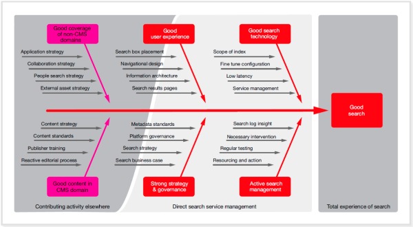
The Bestest Enterprise Search Diagram Ever. Really.
July 19, 2015
I like the word “bestest.” It is so right for diagrams that summarize the complex nature of search. The write up “The Best Enterprise Search Diagram You’ve Ever Seen” is a fetching smile to attract me the person who has never seen a better diagram ever to order a special report. What does the diagram look like? Here’s a not too legible version, but it is close enough for horseshoes:

The pink boxes are contributing activities. The red boxes in the middle of the diagram are direct search management tasks, and the red box in the gray rectangle is the total experience of search. Have at it. Let me know how you fair with your strategy tasks. Also, fill me in on how “search strategy” meshes with the location of the search box. Just askin? I am eager to hear how the search log insight is going to work. I like insight.
For those following this diagram, may I offer a suggestion: Look for a lateral arabesque within your organization or get a Subway sandwich franchise.
Stephen E Arnold, July 19, 2015


